Case Study / Portal UX Design
Turning Rough Wireframes Into a Detailed Portal UX System
A portal UX design project for Public Impact / Opportunity Culture that translated rough wireframes and functional concepts into finalized mockups, interaction flows, role-based screen designs, and demo-ready experiences.
A detailed UX system for a complex education portal.
Public Impact needed a clear, highly detailed UX design system for the Opportunity Culture Portal — a multi-layered platform supporting educators, schools, districts, and states.
Vertical Insite translated rough wireframes and functional concepts into finalized portal mockups, interaction flows, screen-by-screen UX designs, and demo screens that helped both programmers and prospective users understand how the portal would work.
The work focused on UX design and screen mockups only. Programming and development implementation were handled by the client’s development team.
A complex platform needed to become clear enough to build.
The Opportunity Culture Portal needed to support multiple user types, including educators, school-level leaders, district leaders, and state-level administrators. It also needed to handle a broad set of workflows, resources, permissions, and tools.
Because the programming team was offshore, the UX work needed to be especially thorough. Functionality could not be left implied or partially described. Screens, steps, transitions, and interactions needed to be explicit enough to reduce miscommunication and prevent assumptions during development.
- Multiple audiences needed distinct role-based experiences
- Complex workflows needed to become clear and buildable
- Portal functionality had to be mapped across screens and user permissions
- Offshore programmers needed detailed implementation-ready mockups
- Prospective users needed a way to understand the portal before entering the live system
Move from rough concepts to screen-level clarity.
- Translate rough wireframes into detailed portal mockups
- Clarify user flows, screen transitions, and role-based interactions
- Support development handoff with implementation-ready UX designs
- Create a more concrete experience for stakeholders and programmers
- Design demo screens that helped prospective users understand the portal visually
Make the invisible logic visible.
The strategy was to move from rough concepts and functional ideas into a finalized UX system that could guide implementation with as little ambiguity as possible.
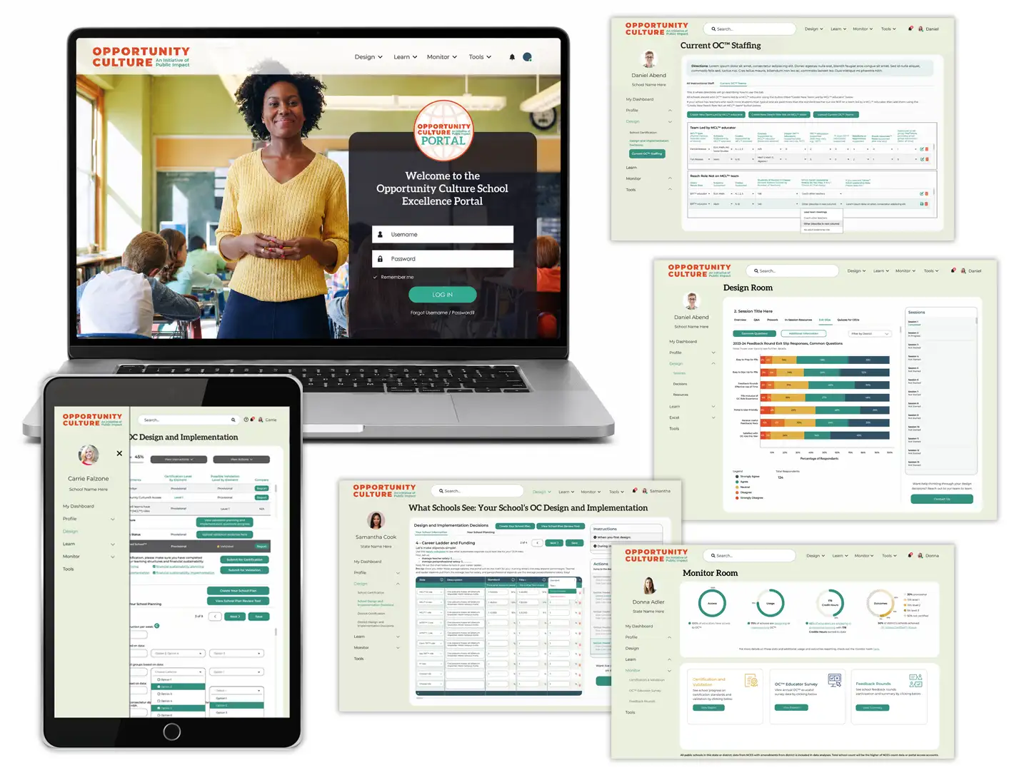
Rather than leaving the development team to interpret high-level wireframes, Vertical Insite converted early concepts into detailed, implementation-ready designs. The focus was on showing not just what each screen would look like, but how users would move through the portal, what actions would be available at each step, and how the experience would differ across user roles.
Designs were created on a Bootstrap grid system and supported by documentation, wireframes, and responsive layouts where needed. This helped bridge the gap between conceptual planning and front-end build execution.
“The goal was to make a complex portal concrete enough for programmers to build, stakeholders to understand, and prospective users to preview.”
Screen-by-screen UX design for a multi-audience portal.
For three years, Vertical Insite supported the Opportunity Culture team by creating UX designs for all stages of the portal experience. The programming itself was completed by the client’s development team; Vertical Insite’s role was to create the user experience designs, refined mockups, and detailed flow structure that made the functionality clear enough to implement.
- Finalized UX mockups based on rough wireframes and functional concepts
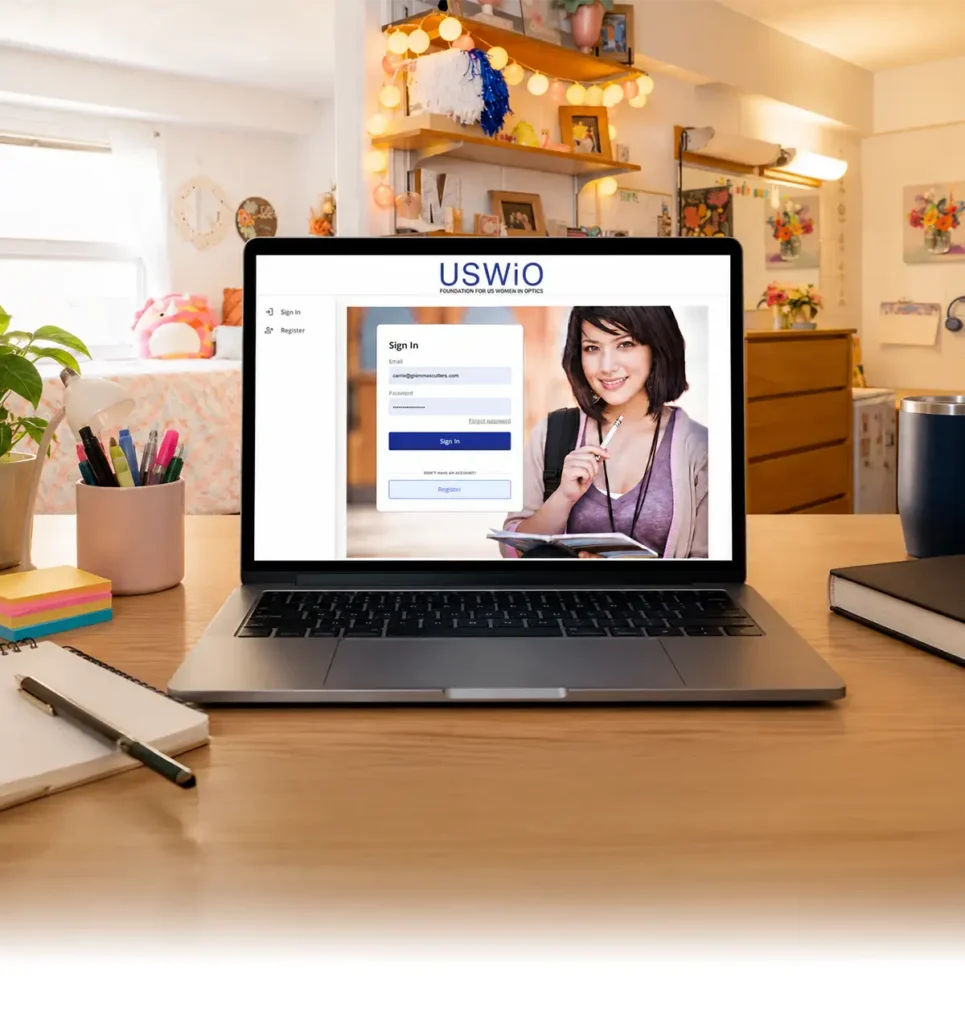
- Login screens, dashboards, profiles, and role-specific portal experiences
- User flows for school, district, and state leaders and administrators
- UX support for instructional resources, staffing design, professional learning, certification, surveys, reporting, and monitoring tools
- Demo-screen mockups for a public-facing portal preview experience
The UX work was not limited to attractive interface screens. It involved clarifying how complex educational tools and administrative systems would be organized, accessed, and understood by very different users with very different goals.
A clearer UX foundation for a complex education platform.
Years of UX design support helped move the Opportunity Culture Portal from abstract functionality to detailed, screen-level user experience design.
The result was a much clearer UX system for a highly complex portal. Instead of relying on loose wireframes or partial assumptions, the client had finalized screen mockups and detailed interaction flows that could be handed to programmers with far more confidence.
The project also helped transform a conceptual portal into something more tangible. The designs made it easier for the client to communicate functionality internally, easier for developers to understand what needed to be built, and easier for outside viewers to grasp the portal’s purpose through demo screens and preview experiences.
“The designs created a bridge between abstract functional goals and a real, screen-level user experience.”
Client Feedback
Clearer communication for a complex portal build.
“Working with Vertical Insite was a game-changer for our team. Their UX mockups helped us visualize an abstract concept we’d been struggling to articulate. It made it so much easier to clearly communicate feature requirements to our offshore development team. They were incredibly flexible, quick to respond, and always willing to jump on a call to clear up any confusion and turn around updated wireframes. Their support made a huge difference in keeping our project moving smoothly.”
— Jessica, Public Impact / Opportunity Culture
What This Made Possible
A stronger UX foundation for an evolving education platform.
Clearer Handoff
Detailed mockups and interaction flows gave programmers clearer implementation guidance for a complex portal build.
Less Ambiguity
The UX designs reduced confusion between client stakeholders, offshore developers, and technical partners.
Role-Based Clarity
Finalized screen designs supported multiple portal roles, permission levels, and user pathways.
More Concrete Workflows
Complex educational and administrative tools became easier to organize, understand, and explain.
Demo-Ready Screens
Public-facing demo screens helped prospective users preview and understand the platform experience.
Stronger UX Foundation
The project helped create a more usable foundation for a platform serving educators, schools, districts, and states.
Need clarity for a complex digital experience?